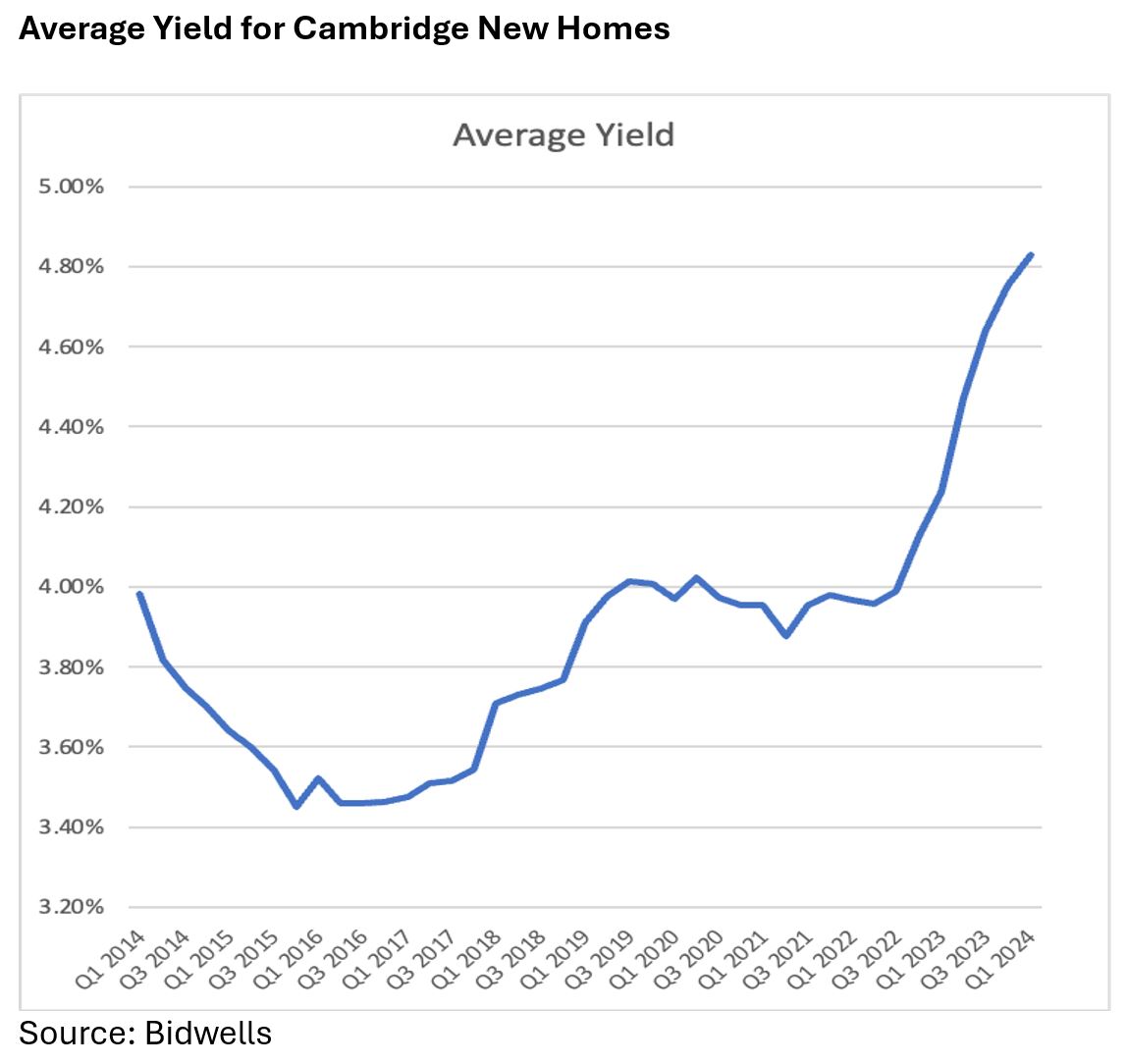
In last week’s post, David Bentley, our Head of Residential, spoke about the decline in new home values over the past 24 months and the difference between different housing types. From an investor perspective the picture requires further detail, so this week David is focussed on one chart that tells it all: The Yield Curve.
The yield curve is traditionally used to demonstrate the relationship between debt and different maturity rates for bonds. We are using something simpler to demonstrate how the balance of rental income and capital growth impacts the investor return on new homes in Cambridge.
Over the past 10 years the average yield for Cambridge new homes based on the current sales and current rental prices at each point in time has fluctuated between a 3.5% return and a 4.8% return. When you consider that the base rate sat beneath 1.0% for eight of those 10 years, the return above bonds has been more than acceptable for many investors, especially those who like tangible assets such as bricks and mortar.

The recent volatility though has added a more interesting dynamic. The historic gain through capital growth has contracted and the return is driven by rental income. Since our time series began in Q1 2014, the rent for a detached village house has increased 123.5%, a one bedroomed flat has seen growth of 142.2%. The acceleration of rents in the past three years has been particularly notable.
From a social perspective lack of affordability in areas of high demand, like Cambridge, creates issues. The yield curve though points to the enduring popularity of residential property for investors. It is not a short term activity, the costs associated with buying and selling, the shift in housing policies by successive governments create risk. The interplay of capital growth and income though provide a level of enduring return.


